Home & Interiors · Creative
Fun With Fonts and Flyers
Making a good-looking printed thing is mostly restraint. Two typefaces, one idea, plenty of empty paper — a small design lesson that quietly improves everything else you make.
By Mara Vance, Editor, Home & Interiors · 19 September 2012 · 5 min read
From the archive. This project first appeared on Homemade Ocean and has been re-edited and fact-checked for the relaunch.
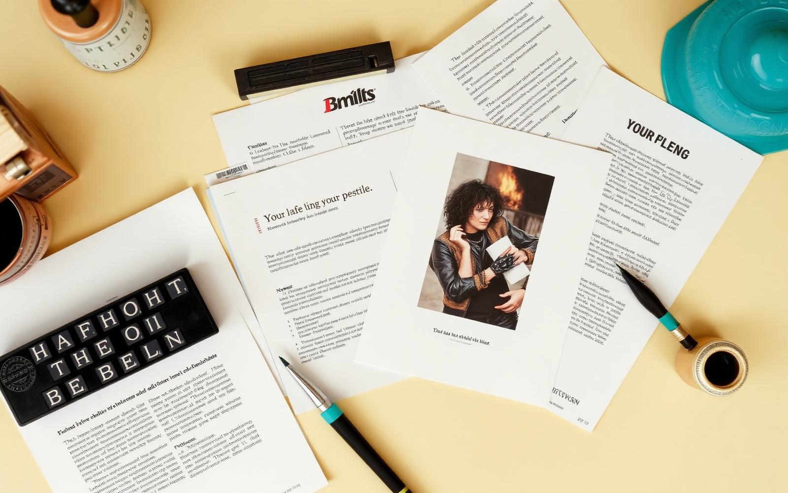
Not everything worth making is made of wood. Some of the most-shared things ever published here were printed: a flyer for a street sale, labels for pantry jars, a hand-drawn map for people coming to a party.
Printed pieces are a good place to learn design because the feedback loop is short and the material costs nothing. You can make eight versions of a flyer in an evening and instantly see which one you would actually pick up off a noticeboard.
The two-typeface rule
Pick one typeface with personality for the headline and one quiet one for everything else. That is the whole system.
- The headline face can be a heavy slab serif, a condensed sans, a wide geometric — something with an opinion. Use it once, big.
- The workhorse face should be boring in the best sense. Something with a full range of weights so you can build hierarchy without changing typeface.
Three typefaces on one page is where most homemade flyers fall over. If you feel the urge to add a third, add a weight or a size instead.
Hierarchy is just size and space
Ask what a passer-by needs to read in one second, in three seconds, and in ten.
- One second: what is this? Biggest thing on the page.
- Three seconds: when and where. Second biggest.
- Ten seconds: the details, contact, small print. Smallest, and it is fine if it is genuinely small.
Do not set those three levels at 24pt, 22pt and 20pt. Make the jumps obvious — 60, 24, 11 — or the hierarchy reads as an accident.
Empty space is the material
The most common instinct when designing a flyer is to fill the page, and it is almost always the wrong one. Set generous, equal margins. Then make one of them bigger than the others deliberately — a wide bottom margin gives a page a grounded, printed-book feel that a centred layout never gets.
Grouping matters too. Things that belong together sit close; things that do not sit far apart. Most amateur layouts space everything evenly, which tells the reader nothing about what relates to what.
Colour, sparingly
One accent colour on a flyer is plenty, and it works hardest when it appears twice: once large and once small. Black text on off-white paper with a single warm accent will outperform a four-colour gradient every time, and photocopies beautifully.
Print it before you judge it
Screens flatter everything. Print a draft at actual size, pin it on a wall, and walk six paces away. Half your problems become obvious immediately — the headline is too timid, the body text is too grey, the phone number is unreadable.
Why this lives on a DIY site
Because it is the same skill. A good flyer and a good shelf both come from deciding what matters, making that thing bigger or stronger than everything else, and having the discipline to leave the rest alone.
Once you have designed a decent flyer, you start noticing the same logic in a room: one strong element, a quiet supporting cast, and enough empty space to let it breathe.
- design
- typography
- printables
- legacy