Home & Interiors · Colour
How to Choose a Paint Colour You Will Not Regret
The colour on the card is not the colour on the wall. A repeatable method for picking paint that still looks right in February.
By Mara Vance, Editor, Home & Interiors · 14 July 2026 · 6 min read
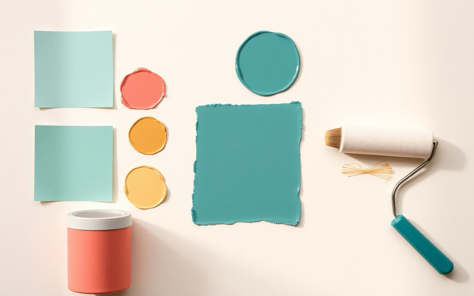
Paint is the cheapest transformation available to anyone who owns or rents a room, and it is also the one people get wrong most often. Not because they have bad taste, but because they choose in the wrong conditions.
Test in the room, not the shop
A colour card under fluorescent shop lighting tells you nothing about how that colour behaves in a north-facing bedroom in November. Buy sample pots. Always.
Paint two coats onto A3 sheets of primed lining paper rather than directly onto the wall. The paper can be moved: hold it against the darkest corner, next to the window, beside your sofa, near the door frame. Wall patches trap you into judging a colour against the old colour surrounding it, which distorts everything.
Live with it for three days
Look at each sample in morning light, in the middle of the afternoon, and under your actual evening lighting. Warm-white bulbs push everything yellow; a beautiful cool grey turns to dishwater at 9pm. If a colour survives all three, it will survive the year.
Which way does the room face
- North-facing: consistently cool, indirect light. Cool greys and pale blues go flat and grey here. Either lean into it with a deep, saturated colour, or warm the room with clay, ochre and soft pink-based neutrals.
- South-facing: generous warm light most of the day. Almost anything works; cooler colours look their best here.
- East-facing: bright mornings, flat afternoons. Warm neutrals hold up all day.
- West-facing: cool until mid-afternoon, then very warm. Test late in the day, which is usually when you are home.
Sheen matters as much as colour
- Matt hides wall imperfections and reads soft. It marks; modern washable matts handle family life reasonably well.
- Eggshell and satin on woodwork. Satin bounces more light and is easier to wipe.
- Gloss on almost nothing, unless the room is period and you want that specific glassy Victorian look.
The tricks that make a room look considered
- Paint the woodwork the same colour as the walls. Skirting, architrave and doors in the wall colour makes a small room read as one continuous volume. It is the single highest-impact decision in this article.
- Bring the wall colour onto the ceiling in a room with a low or awkward ceiling. It stops the eye finding the edge.
- Do not use brilliant white unless the room is flooded with light. It is a cold, blue-leaning white that makes most rooms feel like an office. Choose a warm off-white instead.
The order of work
Ceiling first, then walls, then woodwork last. Cut in with a good 50 mm angled brush before rolling. Two thin coats, always. And keep a labelled jar of each colour in a cupboard — in three years you will need it, and the tin will be dry.
- paint
- colour
- decorating